7 portfolio tips before sending your application (from own experiences).
My parents always told me that building a career would be easy after getting my degree. Sorry mom and dad, I have to interrupt you there. Many experienced designers will know a portfolio means much more than whatever degree you own.
A portfolio helps to serve as a display where the designer can show their past projects and experiments. Also, beside your projects you can show yourself, visitors like to know the human behind those projects.
So we listed the most relevant tips for you from our own experiences. The same tips I wish I knew before applying for that one job.
1. Audience & user centered
It’s important to know which people are going to visit your portfolio website and what your final goal is with your website. Do you want to apply for a job? Are you preparing yourself to freelance?
Knowing what your visitors seeks and reshape your portfolio based on their needs is a good beginning. For example, start with visual impressions of your projects instead of plain text. This immediately attracts the attention of the visitor and wants to see more of the project. With most hosting platforms you can often check the number of visitors, how much time they spend on your website and their location.
At first I thought this was a fun tool and didn't do much with it until I started applying for jobs. For example, I experimented with my website design and how I could reshape and rewrite more purposefully and which adjustments could help me to achieve certain goals.
2. Projects to show
Ask yourself which projects are important to you. This could be anything, maybe it's a project with a lot of emotional value for you? Or a project where you have worked with others from different disciplines? It just depends on which project adds what value to you as a designer.
It is not the intention that you have an overloaded portfolio where there is in fact nothing that shows the skills you want to point up. Sometimes it is difficult to leave out projects. For example if you have a cool idea you like to show but the end result has not turned out the way you wanted it or it is not completely finished. In this case it is important to make choices for yourself about what is relevant to add to your portfolio. Quality over quantity.
Show visitors what you as a creative are capable of delivering. Do you want to be asked for writing jobs? Then put projects in your portfolio in which you show that you master the necessary skills to get hired for this job.
3. The writing process
You don't have to be a professional copywriter for this part of your portfolio, if you think you don't have much to say then look up old notes, chats, feedback notes. There is always at least 1 or 2 good sentences or words that you can use to make a start for your project descriptions.
It is important because not all projects can be self-evident, sometimes a piece of text ensures that you understand it better, while in some cases the work becomes less interesting with a piece of text. So the way you describe your work determines a lot.
Ask the people around you if they can read your texts and then rewrite it a few times until you find the right tone, words and balance. For example, ask yourself why you started that one project in the first place or for more commercial projects, start by briefly introducing the assignment and client.
4. Clear navigation
Clear navigation is just as important as the design of your website. Because if visitors can't navigate smoothly through your portfolio, they won't be able to see your work. Or if they have to make too much effort to find links or something, that can also cause frustration and you have the chance that the viewer will click away from your website.
Try to display your projects in one place that makes it easier for the visitor to click through your projects. Are you going to do this with text? Or with project thumbnails? You can do both if you want, as long as there is a useful layout and positioning for your projects.
You also have other important pages on your website, such as the “About” and “Contact” pages. Make sure that the visitor always has access to these two pages, no matter which page they are viewing at that moment. This ensures the chance that they can easily contact you in the future.
5. Introducing yourself and CV
Your visitors will wonder about the person behind the work. It also makes your online portfolio more human. That is why it is important to create an “About” page here you can write about yourself and put a picture of yourself (only if you want to).
You can write about who you are and or the way you work. If you have an authentic vision about the industry you work in, don't hesitate to share it with the visitors as well. This can be your point of character power. For example, if you want to give future clients or employees an impression about your personal self you can write briefly about which topics you like to work and what drives you the most. You are totally free.
And if not the most important part, but sometimes it can be useful to include your CV as well. Ofcourse your portfolio is worth more than your CV, but this gives visitors an idea of your background.
6. Check mobile, desktop, tablet
While designing your website there are a couple of things to consider, perhaps not the most inspiring aspects, we are talking about how your website will look on different devices. Small effort to check it but something we like to postpone.
You never know what kind of device your portfolio will be viewed through. Your portfolio probably looks fine on your desktop web browser, but on a tablet everything can shift and that could make your website not fully function. Besides that, it's also sloppy not to do anything about it.
Before you publish your website online, so it’s a good thing to check your portfolio via various devices, such as scrolling through the pages, positioning of the navigation, links, images and click on the buttons if everything works as planned!
7. Design part
I don’t like to discuss taste. That’s why I saved this part for last. It’s more important to have a fully working portfolio rather than having a well designed portfolio. In some cases, there will be a few viewers that will attach more value to your design instead of the clear navigation and the content for example.
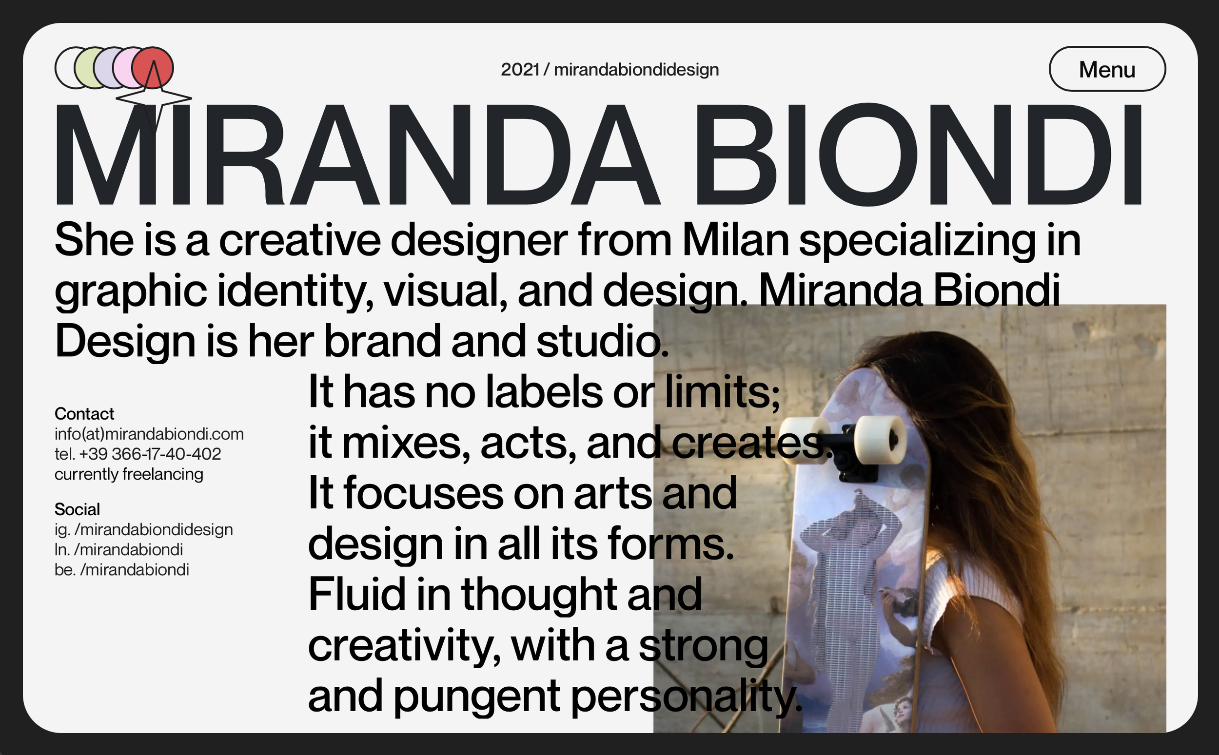
But don’t freak out dear readers, the design of your portfolio really depends on what you want to communicate and who you are as an individual creative. There’s no good or wrong. So we collected a few inspirational portfolios to give you ideas:


